The Burlingame Typeface
With fonts appearing across a huge range of devices nowadays, a type designer’s job involves more than drawing attractive letterforms. As we view more and more media on smartphones and other small-screen devices, typeface choice becomes as much a science as it is an art. At these sizes, the wrong font choice can cause difficulty reading, confusion and eye strain. The need for verstaile, “do-everything” typefaces has never been greater than it is right now, and it’s changing the way that modern type designers approach their work.
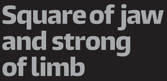
At first glance, Carl Crossgrove’s new Burlingame™ typeface family may look like an unassuming square sans. While that may be true, the details of this typeface synergize into an extremely legible and versatile family that can be used on screen, in print, as headline and as body text
The attention to legibility that the Burlingame collection reflects is no accident. Initially conceived as part of a proposal for a next-generation video game platform, the typeface’s performance on screen and in small sizes was paramount. Crossgrove began sketching letterforms and had the basic forms, but the gaming platform ended up using a different typeface. This freed up Crossgrove’s sketches to receive extra design consideration.
Crossgrove took the Burlingame design and added details intended to increase legibility and readability. Small triangular cuts around joints, which help delineate the separate strokes that make up the letter, were added. Wide-radius curves, and wider bowls in characters such as such as the upper-case “B” help distinguish these letters from letters with similar shapes, aiding with at-a-glance reading. Even after adding these features, Crossgrove saw more room for improvement, such as adapting features from Germany’s DIN 1450 standard for barrier-free legibility. These influences are most evident in the feet on the lowercase “L” and “T” letterforms, which help differentiate these characters from the lowercase “I”.
It’s no small feat that Crossgrove was able to integrate all of these features without compromising the form of the typeface. The Burlingame design remains extremely functional for both small and screen sizes. The aforementioned design features that were added to aid in legibility create unique forms and visual interest when the typeface is used at display sizes. Once the font is reduced to smaller point sizes for screen or text use, these features all but disappear, but their effect does not. The font remains extremely legible and readable, even when using thinner weights.
The result is a family that includes 36 weights, all the way from Thin to Ultra Black and covering 33 languages, making Burlingame one of the more versatile designs released within the last few years. If you have multi-device, multi-lingual needs for your next project, check out the complete family and download two free weights at Fonts.com

