A Collection of The Best Fonts of 2012
Fonts are so important in our work, whether we are working on print or web design. It speaks volumes, especially when we are trying to reinforce our message. The right look can really drive that message home. I have gathered a list of the best fonts of 2012.
Infinity
I loved the Infinity typeface so much, I decided that it would be a stellar font for my rebrand identity. The simplicity, combined with the great shapes really gives it a unique look.
Bariol
 Bariol is a great typeface. it isn’t free, but it is only a few bucks and the rounded font is great in a wide variety of applications. It looks great large, and it works well small. Bariol is a clean, legible font that you will definitely get a lot of use out of.
Null

Null is big and extremely bold. The negative space of the text seems to be chiseled out of thick stone. This is an excellent display typeface that you would use in cases where attention can’t be denied.
Carton

This is an excellent typeface that has a unique look to it. It would look great on a billboard or as a branding typeface. The slab serif font is bold enough to get attention without being overbearing.
Signika
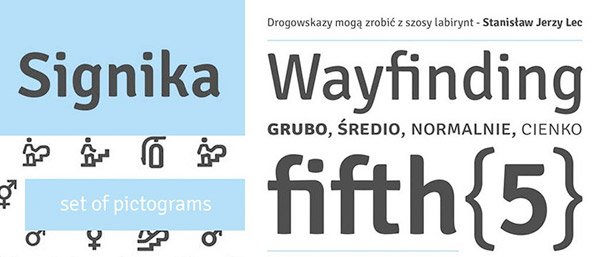
Signika is another wayfinding typeface that is great for signage. It is easy to read and works well in large and medium applications. The slight wave in the strokes make this a unique choice for those who want legibility with style.
Franchise Bold
Franchise Bold is great for signage and anything that you requires a bold presence combined with maximum legibility. Clean, dominant and bold, this typeface is a must have for signage and one of the best fonts of 2012..
Mensch
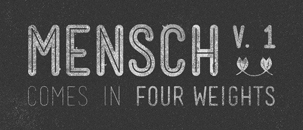
Mensch is a great contemporary font with different weights that work well together. The thin weights work well with the bold and inline weights to really create a killer combo that plays well off of each other.
Pigeon
 Pigeon is an elegant and perfectly balanced typeface that it strong and traditional at the same time. The angled strokes make this an interesting typeface for any occasion.
Barata Display
Barata is a great all-purpose font for sales signs and has an old-timey appeal to it. it is so different and unique, while being bold and dominant. You could use this in a variety of ways to call attention to any sale items.
Mission Script
 Some people hate script fonts, but Mission Script shouldn’t be one of them. When used in contemporary pieces or signage, the typeface has a real Bistro look and feel, making this a great asset in any designers arsenal.
Lavanderia
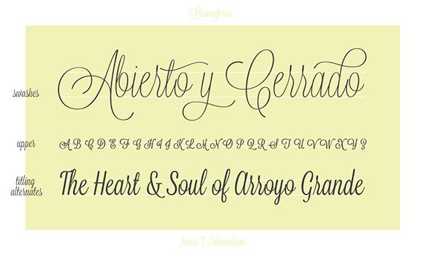
Lavanderia really has an organic feel to it that would appeal to any menu or boutique. It is perfectly legible, while still having a natural appeal. It is elegant and fun at the same time.
Ostrich Sans
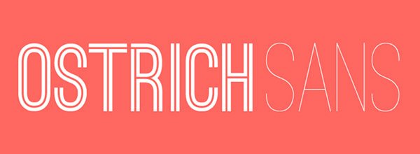
Ostrich Sans comes in different weights ranging from Thin to Bold and Inline. Each weight will work in its own application, and when combined, each weight works well with the other ones. This one font family will go a long way by itself. I have seen this font used a lot this year. This has to be one of the best fonts of 2012.
Age

With clean lines and a bold flair, Age is a great display font for getting a lot of attention. This thick typeface is hard to miss and really has a unique look.
Duke
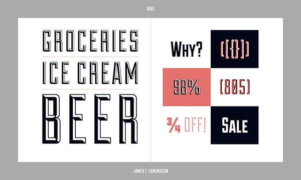
Duke has similar appeal to Sullivan, in the fact that it has its own built in dimension. The balance between shape, stroke, and shading make this typeface appealing.
Homestead
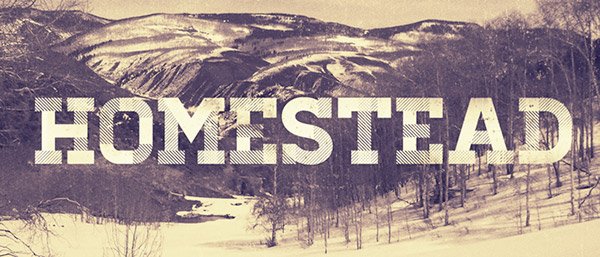
Homestead has the look of a traditional typeface, but it is built with a contemporary flair. The typeface comes in multiple weights and styles, and appeals to a sense of family and earthiness.
Abraham Lincoln
 Abraham Lincoln is a strong vertical font that speaks of tradition and sophistication. Its look immediately makes you think of trust and loyalty.
Archive

Archive is a great font, because of its clean look and rigid structure. The slightly rounded edges soften the typeface, without detracting from its appeal.
Sullivan
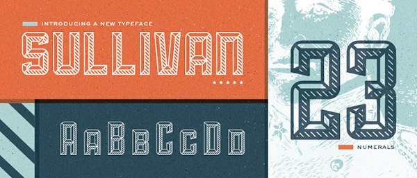
Sullivan is one of my favorites, because of the built-in shading of the typeface. it really gives the font a sense of raised dimension, making the lettering jump off of the page.
Tommaso
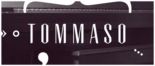
Tommaso is an elegant typeface. The balance between the thick vertical strokes and the thin horizontal strokes give this font a very classic look.
Sahara
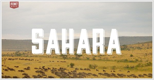
The blocky and prominent look of Sahara really makes this typeface grab your attention. The built in shadow adds dimension without detracting from the actual lettering. It actually enhances the look of the typeface.
Cassannet

The Art Deco style of Cassannet is wonderful. The ability to pull visual influence into your typography from the Art Deco period will come in handy for any serious designer.
Dekar

Dekar is beautiful and elegant, with its thin strokes. It would look great in technical applications. It is unique enough in its appearance that you could use it for identity purposes.
Novecento
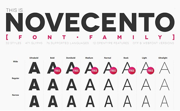
Novecento is big, round and extremely bold. It comes in thinner weights as well. They are all clean and beautiful and work well with each other. you can combine different weights to make a truly beautiful design. A lot of people have used this font in their design work. It is one of the best fonts of 2012.
Oval Single

Oval is big and bold, and the diagonal strokes make this font unique and beautiful. The softness of the rounded edges really make this a friendly typeface for fun purposes.
Satellite
 Satellite is a great thin typeface that is rounded and beautiful. It is elegant and would work well in technical and mathematical applications. You could definitely use this typeface for infographics and anything with numbers and statistics.
Static
Static is a great set of fonts with varying weights. The typeface is tall and rounded, making it a great contemporary choice for your designs.
Sansita
Sansita is absolutely gorgeous! It has a real emotional appeal, and the waviness, combines with the thick, bold strokes make this font an excellent choice for anything that you designed where emotional appeal is important. It is soft and clean, and creates great flowing text. This is one of the best fonts of 2012.
Conclusion
The typefaces that I have showcased above are all special in their own way. They are all well crafted and beautiful and show off great typographic skills. Typography has really exploded lately, as more and more people are venturing into creating custom lettering for design work.
What is your favorite new typeface of 2012? Do you like one not shown here? If so, post your favorite typeface in the comments section below.

