The Most Iconic Logos
When you are thinking of developing a company logo, one of the best places to start is by turning to established success stories. We are going to examine ten of the most iconic logos in the entire world. We’ll explain what has made them so memorable.
What makes one logo more iconic than another can be pretty complex. Even great logos which lack a great product to back it up can be easily forgotten. These top ten logos are well designed, and have been both consistently repeated and sufficiently backed up with high quality products. Michael Johnson, who works as creative director at Johnson Banks, points out that an iconic logo has to produce on several different levels. These include the product itself, the environment the logo is presented in, and the tone of voice expressed. Read more here: http://www.creativebloq.com/branding/most-iconic-brands-11121149

1. The Red Cross
This company deals with medicine and working to save people’s lives. The strengths of their logo is the direct embodiment of their name. One need not go through mental jumps to remember the name of the company which is associated with that large red bolded cross.
Another plus for this logo is the universal nature of the design. Although the Red Cross has popularized a particular style of this symbol, the cross itself has been connected to medical aid long before this particular organization existed.

2. Apple
The logo for apple reflects its company’s values. This company strives for simplicity and a clean modern look. The apple icon, which is present across all of their merchandise, connects to the very reasons customers seek these products.
![]()
3. Goodyear
The winged foot has become deeply embedded in the Goodyear symbol. Echoing thoughts of the Greek God Hermes, this symbol was selected in order to embody speed. Goodyear intentionally sought to connect the speed of the Gods to the speeds you’ll be able to achieve with a pair of their tires.
![]()
4. Mercedes-Benz
This logo has evolved considerably over the years. Originally the logo lacked the geometric symbol which has become synonymous with the company name. The three pointed star was introduced 1910 to embody the company’s desires to have their machines on land, on air, and on water. Today the three pointed star is connected in a circle which unifies all three points. The simple geometric shape has been reproduced across all of Mercedes-Benz merchandise.
![]()
5. McDonalds
The golden arches of the McDonald symbol are synonymous with classic American fast food all over the world. The original logo for the company lacked any such arch shape. 1960 when designer Stanley Meston was inspired by the architecture of the restaurants at the time to create the familiar golden arches. Since the creation of this design, it has been simplified and streamlined over the years. The most recent manifestation doesn’t even include the company’s name. It just features the gold arches themselves.

6. Burger King
This company has always tried to connect their products directly to their logo. The original logo included a cartoon king sitting atop a hamburger. The king himself has been removed from the logo, although he is still used in various marketing campaigns. However, the hamburger theme has remained. The Burger King logo features their company name situated between two bun halves. Today the logo features an additional blue curved line designed to add depth to the basic burger motif.
![]()
7. Google
The first google logo didn’t look radically different from the current logo. One of the biggest differences was the exclamation point at the end of the image. This piece of punctuation was there to mimic the company’s main competition of the day, Yahoo. Today the symbol universally connects to the Google company. Interestingly, on celebratory days, the online version of the symbol is modified in a playful way. This causes significant buzz online since so many people notice the alterations.
![]()
8. Walmart
This company has also stayed fairly true to its original design. Walmart has opted for a font based image with minimal graphic elements. Originally the Walmart letters were black set against a white background. Eventually, the colors were inverted. Most recently this logo has changed the font color to blue with a star incorporated into the design. Today this star has added some excitement to the logo with its yellow color and almost firework like design. Much like those who frequent Walmart, their logo is quite practical and straightforward.
![]()
9. 7-Eleven
This logo was originally designed to have the company name inside of a cup set against a green background. The colors of the first logo were white, green, and red. Today the logo has been modified to increase the size of the number seven as well as add a new color, orange. The basic cup shape has remained the same.
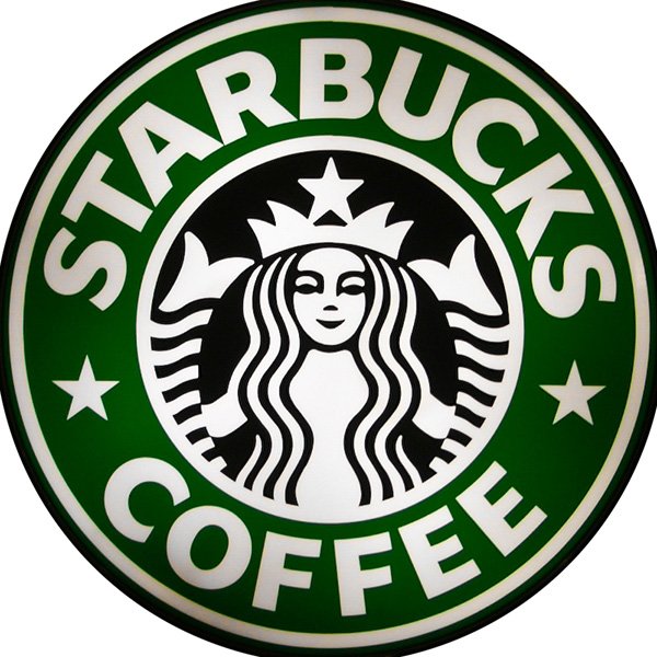
10. Starbucks
The famous starbucks mermaid actually came from a Norse woodcut featuring a two tailed siren. Over the years, the bare chested mythical creature has been modified considerably from its initial manifestation. The biggest trend in the evolution of this logo has been featuring less of the siren’s body. Similar to other companies, the most recent version has dropped the company name and is strictly picture based.
You can learn more about the history of these, and many other iconic logos here: http://www.complex.com/art-design/2013/03/the-50-most-iconic-brand-logos-of-all-time/.
Written by Louise Williams, a professional writer and graphic designer out of Virginia. Find her on Google+.

