What is Type & Grids Pro?
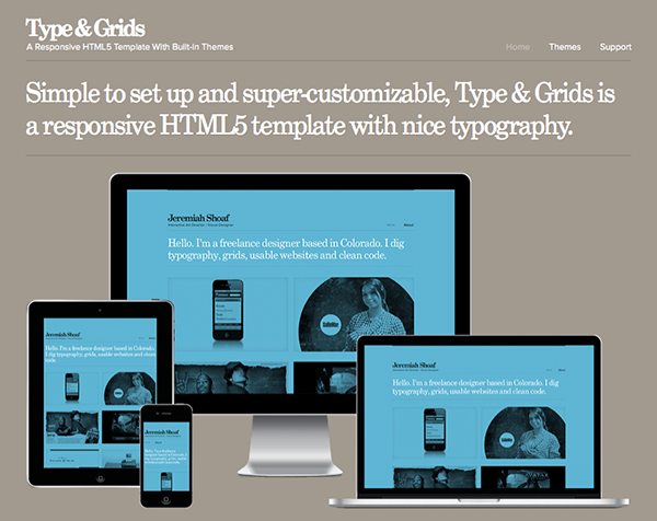
Type & Grids is a HTML5 template that focuses on typography and grids. It’s responsive which means it looks great on all devices from desktops to laptops to tablets and mobile phones. It’s super-customizable and comes with lots of nicely designed type and color themes.
What are the Features of Type & Grids Pro?
Features
- Simple to set up and update – all of the content is inside a single “index.html” page
- Contains 20 type themes and 28 color themes which gives you over 500 unique design combinations – 58 background textures are included as well
- Each type theme is meticulously handcrafted to ensure attention is paid to the small typographic details
- Fully responsive design – looks great on all devices from desktops to laptops to tablets and mobile phones
- Swipe-enabled with hardware accelerated transitions – works super smoothly on touch devices like the iPhone and iPad
- Coded using the latest HTML5/CSS3 standards and all code is W3C valid and cross-browser compatible
- Video support – easily embed your videos from Vimeo or YouTube
- Clean and semantic SEO-friendly code
- Design featured on the FWA Public Shortlist, Creattica and numerous other design sites
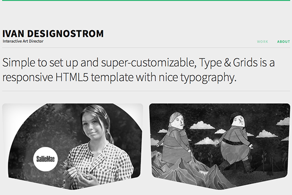
- Works great for non-portfolio sites as well – the site you are viewing now is using Type & Grids
- Support and documentation is available but everything is so simple to set up you probably won’t need it

Creating your websites while using a responsive html5 template will make your websites more flexible and mobile-targeted. In this day and age, you can’t ignore mobile users.
So How Do I Win?
It’s really simple! All you have to do is comment to win! Some suggestions are: If you won a copy, what would use it for? talk about why you feel that Responsive design and HTML5 are important. You can also just say what’s on your mind. We want to hear from you! 3 winners will be chosen at random. The contest ends at 11:59PM EST March the 4th 2013. The winner will be announced March the 5th 2013. Good luck and thanks for entering!

