
Most Popular Fonts of All Time
As a designer, learning to use fonts is an absolute must. Whether you’re learning the ropes or you’ve been in the field for years, you eventually develop a go-to list of fonts that you use regularly. This list will consist of a group of the best fonts that you can mix and match to use for a wide variety of purposes. Knowing font combinations is a huge help, too. If you want a great place to start your go-to list of fonts to add to your repertoire, you’ll want to start with the most popular fonts of all time. Looking at the most popular fonts of all time will help you to see what designers have used for decades, and give you a great starting point. Below, I’ve listed the top 20 most popular fonts of all time.
Helvetica

From Crate & Barrel to Toyota, Staples, American Airlines and Jeep, Helvetica seems to be in everything. It’s been popular for years, and even though many consider it overused, you can’t deny it’s place as arguably the most popular font of all time.
Garamond 
Garamond is an excellent font for books, because of its readability. The balance between stem thickness and serifs is superb.
Frutiger

Frutiger is a great go to font for a wide variety of purposes. It squared off ends and the right angles in this font are what makes it a strong choice. Notice how the dot of the i is even square.
Univers

Universe has a multitude of weights, which makes it great for documents, and magazines. It is a clean, non-nonsense typeface.
Times

Times is the quintessential newspaper font. Besides being the default font for Microsoft Word for a couple of decades, this is probably the most widely used serif typeface of all time. If I had a top 2, Helvetica would be number one for sans serif, and Times is definitely the top serif font.
Futura

Modern, sleek, and well balanced, Regular Futura and the condensed version are everywhere. The Stem to curve ratio is what makes it look so great.
Bodoni

Bodoni is a great font, for its unique appearance. The thick strokes combined with the super-thin serifs make this the ultimate typeface for contrast.
Franklin Gothic
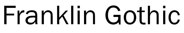
Franklin Gothic is a great typeface for balance. Its even presence and taller x-height make this typeface a classic.
Bembo

Bembo is a delicate typeface. The stems themselves aren’t that thick, and in places it gets tediously thin. it’s unique look is great for anything where you want a subtle presence.
Rockwell
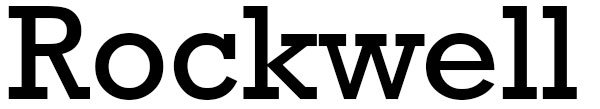
Rockwell is one of the most iconic slab serif typefaces of all time. With its sharp angles and flat edges, you know rockwell when you see it.
DIN

DIN is a powerful typeface with a great equilibrium. The thickness is uniform throughout, and it has a solid, sturdy look.
Sabon

Sabon is an immensely elegant typeface with a unique presence. Notice the straight angle on the top curve of the a.
Gill Sans

Gill Sans is a well balanced medium weight typeface that is great for scientific, technical, or educational applications. The thickness is balanced well throughout the typeface.
Optima

With it’s tapered stems and varying curves, Optima is a widely popular typeface for its unique look.
Baskerville
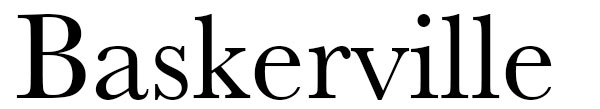
I’ve always been a fan of Baskerville. With rounded transitions to its serifs, and the signature tail on the a, Baskerville has been a staple of the design world longer than most of us have lived.
Didot

Didot and Bodoni are in the same family in the way of looks. In fact, many novice designers can get the two mixed up. Didot’s stems are generally thinner, and it’s thin serifs are slightly longer. Either way, the mix of thick and thin gives a great sense of delicate contrast.
Clarendon

A beautiful slab serif typeface mixed with rounded inside corners. its the sharp outside corners. mixed with the rounded inside corners that makes this a popular typeface.
Caslon

Caslon is one of those classic typefaces that you’ll see everywhere. It’s strong presence make it great for headlines. The mix of thick and thin widths with rounded serifs creates a killer combination of contrast. Notice how much the C stands out with its sharp serifs. Your eye almost wants to close the space, but the serifs are just far apart enough your your brain not to make the connection.
Palatino

With gentle tapering sleek thickness variations, this serif typeface is great when you want something to stand out. Notice the slightly tilted axis of the lowercase o.
Akzidenz Grotesk

A well-balanced typeface that has a great equilibrium. The thickness is nearly uniform across the entire typeface, making it immediately noticeable.
Conclusion: Most Popular Fonts of All Time
So which ones do you think are the most popular typefaces of all time? Is there one you’d pick that I didn’t include? I’d love to hear your thoughts on this. Leave your reply in the comments section below.

