How to Use Media Queries
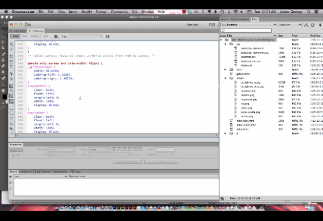
Responsive design is important for making your websites look great on all devices. Knowing how to use media queries gives you a lot of control over device specific layouts as well as how they behave. In this week’s video, you’ll learn what media queries are and how to use media queries in responsive design. You can use media queries to control how your site looks, and how it behaves on specific devices. There are a lot of advantages of media queries, and surprisingly, they aren’t difficult to use. In the video below, I show you what media queries are, and I break down how you use them to specify devices.
The part I like about media queries the best is that you can specify a range in pixels of the width of your device and how the design looks in that width. The advantage of this is that if the width of a device changes, you can go back and manually adjust the device with, instead of recalculation percentages for all of your divs. To me, this makes it much faster and easier to go back and update your site for specific devices. If you do the math, then you’ll realize that 33% of 768px is proportionate to 33% of any other full width, so that div will always be 1/3 of the total width.
How did you do with Media Queries?
How did you do with using media queries? Did you try it out? Did you run into any problems? If you need some help or have more questions about media queries, be sure to post your questions below and I will try to help you as best as I can. Do you have another method for responsive design? What are the advantages of your method over using media queries?

