Responsive Design
Are you an expert at code and programming? Even if you are, you’ll have some challenges when starting your first few responsive website designs. This is due to the complete gear change in how one thinks about these modern layouts. Before starting your first design for a responsive website, try following these five steps:
1. Not All Screens Are The Same
Decide on only a few different screen resolutions to concentrate on at first. If you try and take care of all the various sizes available from the beginning, it will make the web design work very intricate to complete. Keep it simple and work with only four screen resolutions as follows
- desktop widescreen monitor
- desktop and laptop small monitor
- tablet screen
- smart phones
This the web design approach we take at Differently, and it focuses your designer mind on what really matters.
2. Optimize Content
Simply because you can zoom the website in and out, that doesn’t count as truly responsive design ! You should take the time to maximize the layout of the content.
For example, a person using a smart phone does not have much screen room to work with. Your first idea might be to simply zoom out, so the entire website can be seen on the limited screen area. On some display screens such as the Apple Retina this makes good sense, as the content is still understandable, but lowers readability down for many other smart phone end-users on lower resolution screens.
Instead of the zooming out option, experiment with techniques which will make smart phone users love to interact with your website design – limiting columns can really help with this.
3. Different Users Want Different Info
Vary the content as an option to just shifting it. Consumers using different platforms are probably going to have varied needs.
Anyone investigating a restaurant on their smartphone, as an illustration, will be skimming for the restaurant street address, opening hours, and probably any customer ratings – they won’t be going if the reviews are weak. So serve up this content first of all in an easy and noticeable spot to find in your website design.
On the other hand, somebody using a desktop to examine a restaurant’s website is probably coming to a decision whether they want to go to your restaurant. Therefore, you should sharpen your content on convincing them to go eat at your restaurant.
4. Flexibility is Key with Web Design

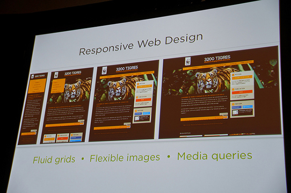
Use fluid grids to make a “liquid layout” as an alternative to a preset width layout. Most web site designers find fixed width layouts, which are customary, much easier and simpler to create. However, the usage of fluid grids will be more convenient in the long term when it comes to responsive website design, since they’re carefully developed to take into account proportion.
5. Coding for Media Queries
It is nigh on impossible to create a single website design which covers the thousands of different devices and screen resolutions, ranging from desktops to mobile phones. Coding media queries for the responsive design is one way to accommodate them all.
Media queries allow web designers to make conditional stylesheets for a website design. Dependent on data from the user, a separate stylesheet will show. As an example, you might possibly have two media queries:
- one could be used when the device’s width is bigger than the width of the website
- the second may be used when the device’s width is smaller.
Irrespective of being such an uncomplicated concept, responsive website design has a tendency to be extremely challenging at first when put into practice, as it requires you to think about many diverse scenarios. Having said that, if you follow the tips detailed above, you’re going to be creating responsive website designs in no time at all.
By Geoff Roy
Geoff Roy does web design for Differently, a digital agency in Hampshire, and loves the world of web design and what it can do for your internet presence.

