by jamesgeorge | Apr 29, 2015 | Articles, Fonts, Typography
Thin Fonts For Sheer Elegance I love the look of thin fonts. There’s just something about them that gives a design the appearance of elegance instantaneously. When combined with a heavy weight font, you get the ultimate amount of contrast that makes any design...
by jamesgeorge | Apr 23, 2015 | Articles, Typography
Abstract Fonts That Make a Bold Statement The fonts you choose for your projects say a lot about your client’s products and their company. Some clients like to make a bold statement, and these abstract fonts will help with that. Some of these abstract fonts are...
by jamesgeorge | Feb 19, 2015 | Articles, Typography
Slab Serif Fonts: 15 You Should Use in Your Designs Slab serif fonts are excellent for adding character and impact to your designs. Some are thick, and some are thin. However, they all have a distinct presence that really grabs attention. You will mainly use them for...
by jamesgeorge | Oct 27, 2014 | Articles, Design, Typography
Common Typography Mistakes Typography isn’t just about the words. A lot of the message is sent through the typeface itself. The way your typography is structured, the typefaces you use, and the colors and arrangement of type all come together to create a...
by jamesgeorge | Oct 15, 2014 | Articles, Typography
15 Free Bold Fonts You Should Be Using I don’t have to tell you twice that selecting a typeface for your headlines and headers is important. Choosing the right typeface can really make your text stand out. A good display typeface can change the entire look and feel of...

by jamesgeorge | Jun 12, 2014 | Articles, Fonts, Typography
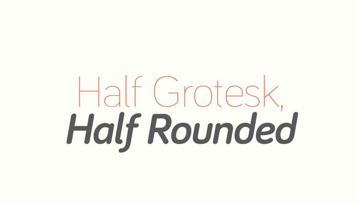
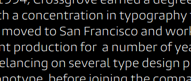
The Burlingame Typeface With fonts appearing across a huge range of devices nowadays, a type designer’s job involves more than drawing attractive letterforms. As we view more and more media on smartphones and other small-screen devices, typeface choice becomes...