by jamesgeorge | Jul 12, 2010 | Illustrator, Photoshop, Tutorials, Typography
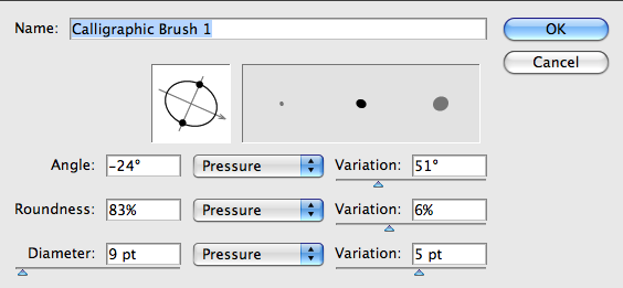
I recently posted a tutorial on the blob brush in Illustrator. Using this tool, you can create some nice hand written effects. First, open up Illustrator and grab the blob brush tool. Go into your brushes panel and create a new brush. I will note that this is much...
by jamesgeorge | Jul 6, 2010 | Articles, Typography
X-height refers to the height of a lowercase letter in a typeface or the top of the midpoint of lowercase letter such as d, p, q and so on. Some typefaces have a tall x-height, some medium, and some have a short x-height. This drastically changes the look of the text...
by jamesgeorge | Jun 23, 2010 | Articles, Typography
Weight and Width Understanding how type works is an essential part of design. Weight and width can both have a drastic effect on the look and feel of an overall design piece. This is true for both print design and web design. Understanding how letterforms interact...
by jamesgeorge | Apr 9, 2010 | Articles, Typography
This is a list of 10 quality serif fonts that you will find in most professional graphic design work. These are all found in body copy of books and magazines. They are all beautiful and elegant for their own reasons. They all come in different weights and italics,...
by jamesgeorge | Apr 5, 2010 | Articles, Inspiration, Typography
11 Quality Fonts to Use in Your Professional Design Work Quality fonts make your work look much better than using free novelty fonts. Granted, there are some really well-crafted fonts out there for free now. However, if you are looking for high quality fonts for your...

by jamesgeorge | Mar 7, 2010 | Photoshop, Tutorials, Typography
This tutorial will create a glossy/shiny effect in Photoshop that is real simple, but it better than just plain text. To create this quick type treatment, create a new document in Photoshop. Mine is 600 x 800, but use your own size for your own purposes. Choose a nice...