Branded Duotone Effect in Photoshop
Carrying out your branding through your marketing materials is not always an easy task. Sometimes you have to unify elements to tie everything together. Not all images fit the same look and feel, which can break continuity and unification across multiple elements. If you can somehow create an effect for your images that unifies your images, you’ll create a consistent and recognizable branding experience. In my tutorial, I am going to show you how to create a branded duotone effect in Photoshop, without destroying your images.
Set Up
Set up for this effect is very easy. Here is a step by step way to create traditional duotones in Photoshop. Typically what you would do for a duotone effect is to duplicate the photo. Once you have a copy of your image, set the copy’s color mode to grayscale. To do this, go to image, then Mode, then grayscale. Then go back into Image, then mode, then select Duotone. From there you can choose the different colors. This method is tough to control, because you get a curves adjustment method for making adjustments. You don’t have as much control and it doesn’t look as good. It’s also not as flexible as what I am going to show you.
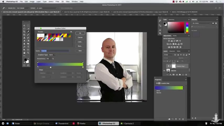
Instead, you don’t even have to duplicate your image. Open your image in Photoshop. In the Layers Panel, click the adjustment layer icon and choose Gradient Map. When you look at the gradient that is applied, it is usually a black and white gradient. Choose a dark and light color from your brand colors. In my example I chose the blue and green values. I clicked on the black color and changed it to the blue, typing in the hex value. For the white, I chose the green.
Once you have set that up, evaluate your image. Depending on your setup, you may not have the best results, depending on your image. You want to make sure the dark brand color is set to the dark areas of your image, and the light brand color is used on the lighter areas of your image. If this is backwards, click on the reverse gradient option to switch them.
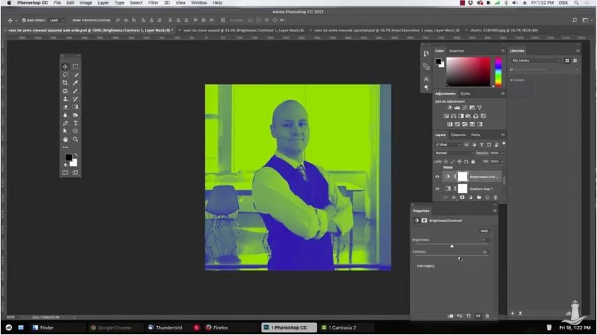
Once you’ve done this, if you need to make any further adjustments, use adjustment layers to do so. I added contrast to the image by adding a Brightness/contrast adjustment layer and bumping up the contrast to taste.
The best part about this duotone effect is that you have better control over the outcome, and it is completely non destructive. How did your duotone effect turn out? Did you run into any trouble? if so, leave a comment and I’ll do my best to help you.

