How To Make Responsive Web Design Engaging?
Responsive web design is the hottest trend in the world of web design. The use of responsive methodology on the design of a web page makes sure that it is mobile-ready. In short, the layout of the web page will become the same irrespective of the screen size of the device used to view it. This means that navigating through a web page using your mobile phone is as smooth as it is when navigating with the use of a desktop computer. With the increase in the number of people using tablets and smartphones to surf the Internet, everyone should find it easy to view your website. However, just the use of responsive methodology in the design of your website is not enough. You also have to take help of your creativity, and make your responsive website design effective enough to engage your targeted customers.
Following are some tips to make your responsive website look more appealing:
Smart Use of Typography
You have to consider how your website is going to look on a smaller screen. You have to remember that as the screen size of a device decreases, all the elements of your website should also shrink and adjust themselves accordingly.
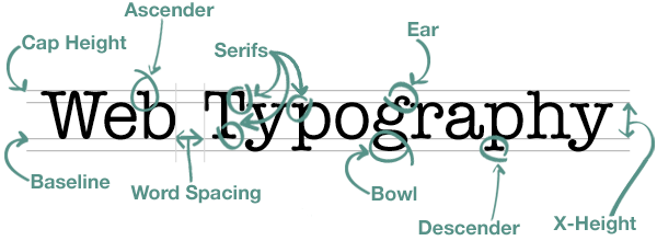
You need to make sure that every line of text is easily readable when the screen size decreases from a 20-inch desktop computer to a 4-inch mobile device. Firstly, you must introduce a proper hierarchy in your content. It is a smart move to go for large-sized headers and headlines for our desktop designs. A plug-in like FitText helps to resize the text according to the size of a particular device. Another useful plug-in is Smith, notable for its use of different typefaces. These typefaces not only set up an eye-catching feel and look, but also vary the font sizes throughout the website.
Read more about Typography Here.
Inclusion of High-Definition Images
We all love to see visually vibrant images. Therefore, you must pay extra attention on the images you choose to present on your website. Similar to typography, it is better to go with larger images. Large images, even if scaled down, are still understandable as they have lesser chances of losing the clarity out of proportions. If you are planning to use graphical content in your website, make sure that you use flat design as it will make your website load faster.

Gone are the days where the use of small, hazy pictures was enough to convey a meaning. Nowadays, only the high-definition images get the required priority. You should always choose high-definition pictures to attract your target audience, and increase your conversion rate.

Make it Fun to Use
Generally, people who surf the Internet using a mobile device are impatient. Mobile users do not like sitting idle and waiting for a page to load. It is even more irritating to find the precise button that will take the visitors towards more content. You should add drop-down menus for your visitors. Try to think out of the box! Just use of creativity when all else fails. There are no constraints in responsive design, and you can always add your own touch in the coding and the designing process to make your website memorable and fun to use.
Conclusion
Responsive design is not an almighty task. The tip is to sketch out the concept, revise it thoroughly, and implement it without fear. The main focus is to make the website attractive and engaging. Once you are complete, it is rather simple to carry out the responsive process.

